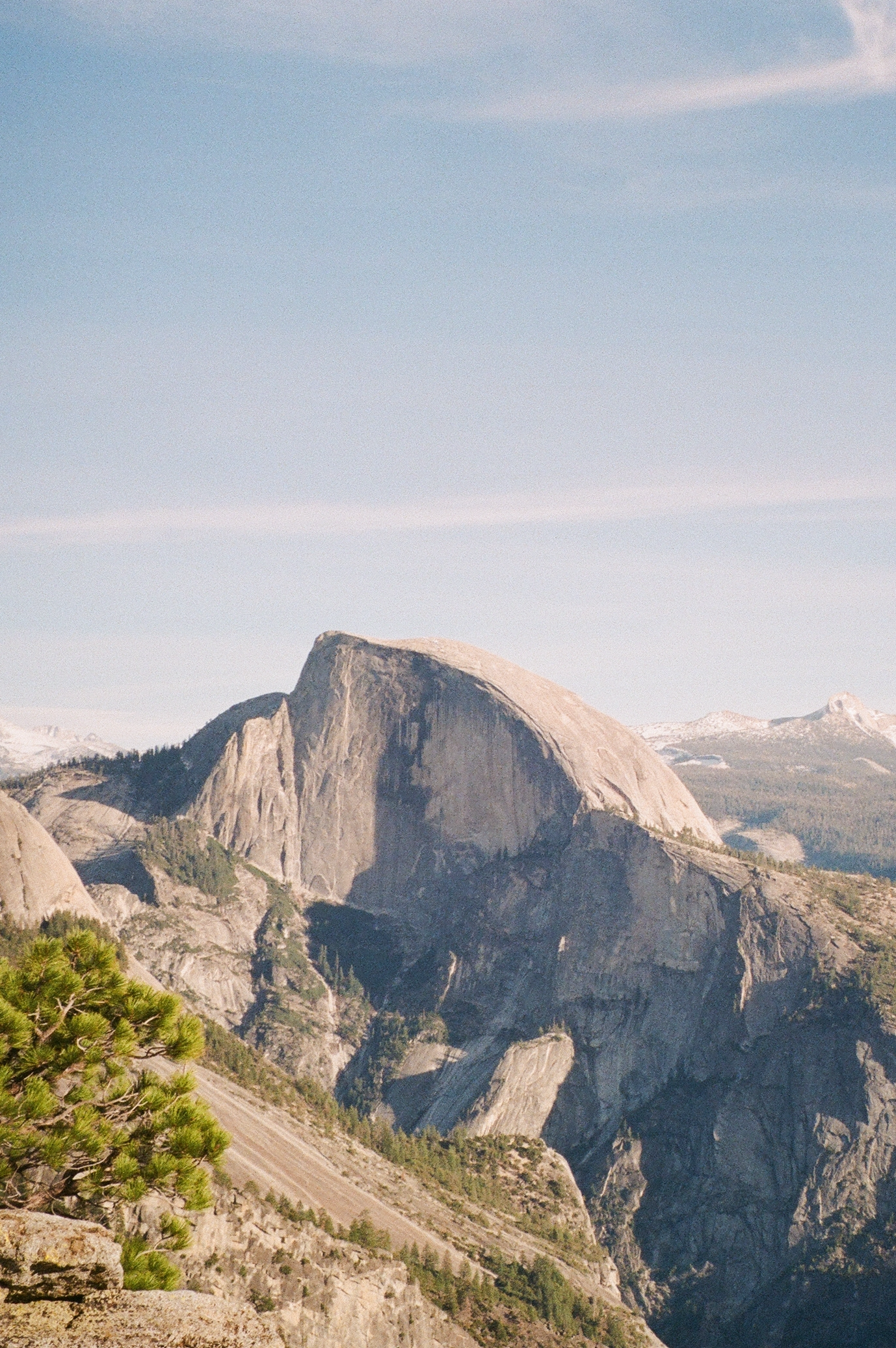
Exploring Climate Change in California


Start scrolling to see the effects here at home.


Half Dome
Half Dome
Yosemite National Park, CA
Nov 2021

Interaction tips:

  • Click on the dropdown menu below the graph to filter out the line for “Worldwide” (and zoom in on country-level data)
  • Click on the specific countries in the legend on the right to highlight that country in the visualization. To deselect a country, click outside of the legend.
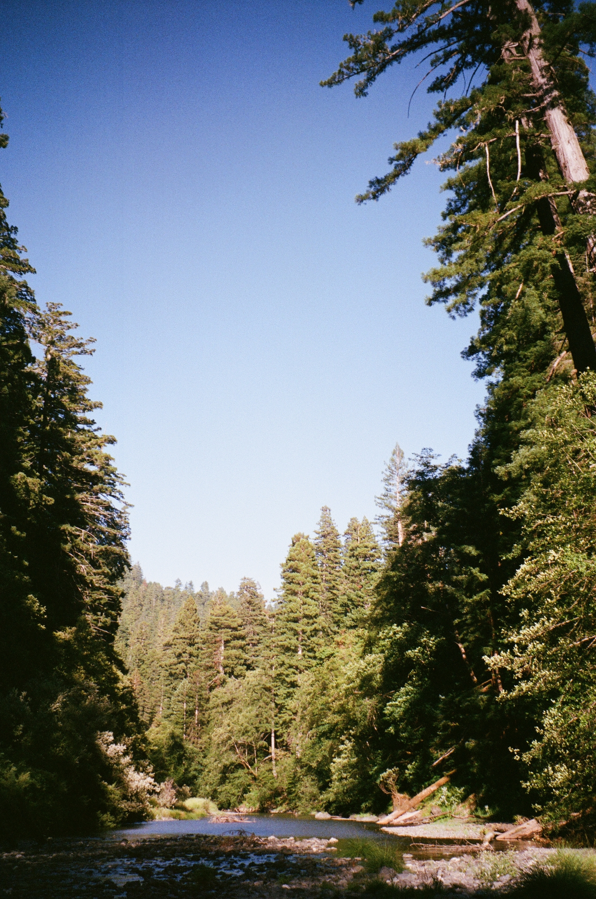
Data: Our World in Data
Tree
Redwood Creek
Redwood National Park, CA
Jul 2021

Interaction tips:

  • Click on the chart filter below the map on the left to compare the selected year’s CO2 emissions with 2019’s CO2 emissions (on the right).
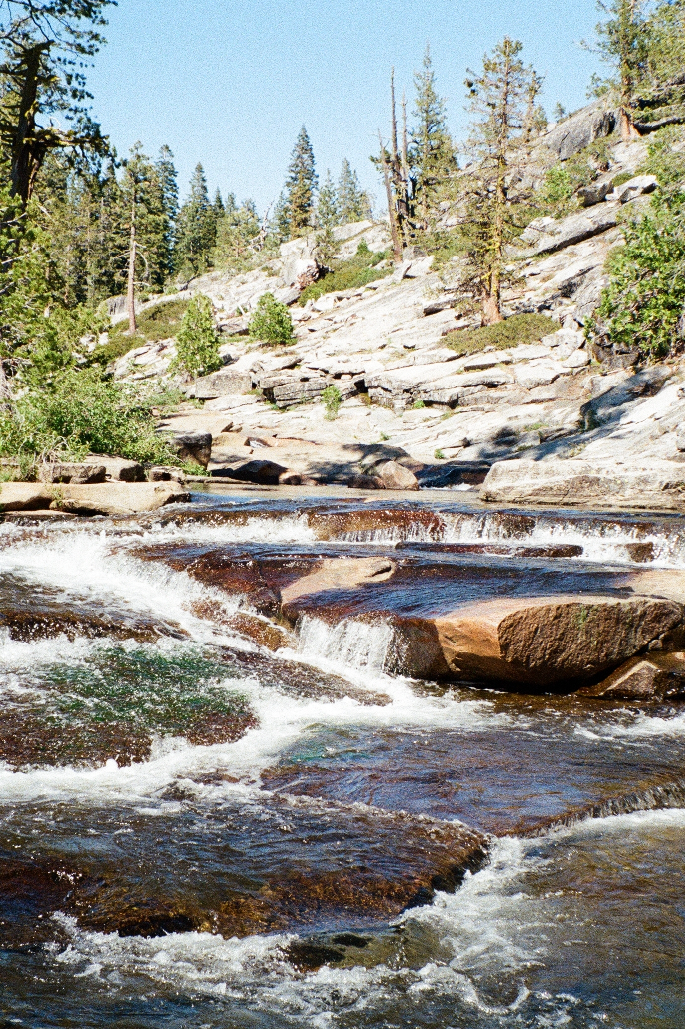
Data: California Air Resources Board
Rocks
Stanislaus River
Stanislaus National Forest, CA
Jun 2021

Interaction tips:

  • Adjust the slider on the top to compare any time period (represented in yellow) with the current time period from 2014-2020 (represented in blue).
  • Note the darker yellow and blue lines in the chart. These represent the average monthly rainfall within the selected years.
Data: PRISM Climate Group
Mountain
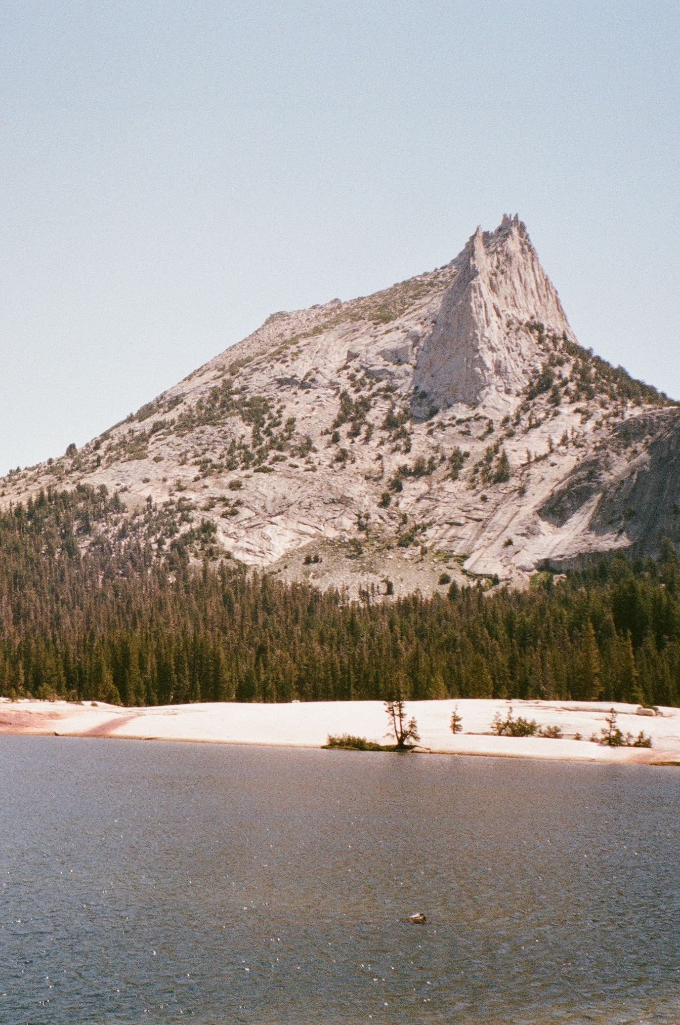
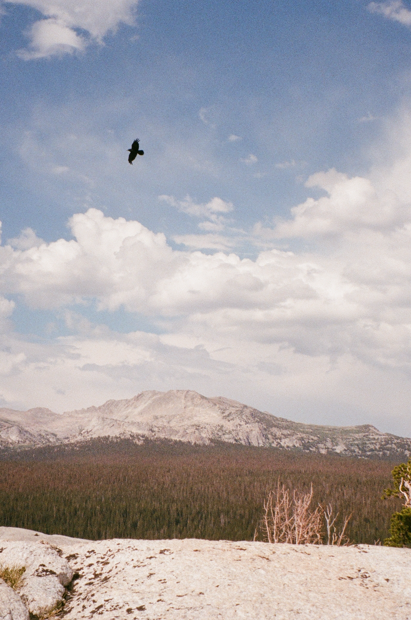
Lower Cathedral Lake & Cathedral Peak
Yosemite National Park, CA
Jul 2021

Interaction tips:

  • Mouseover counties to identify the county name, and the percent of the county in extreme (D3) or exceptional (D4) drought.
  • Scroll right to see more recent years.
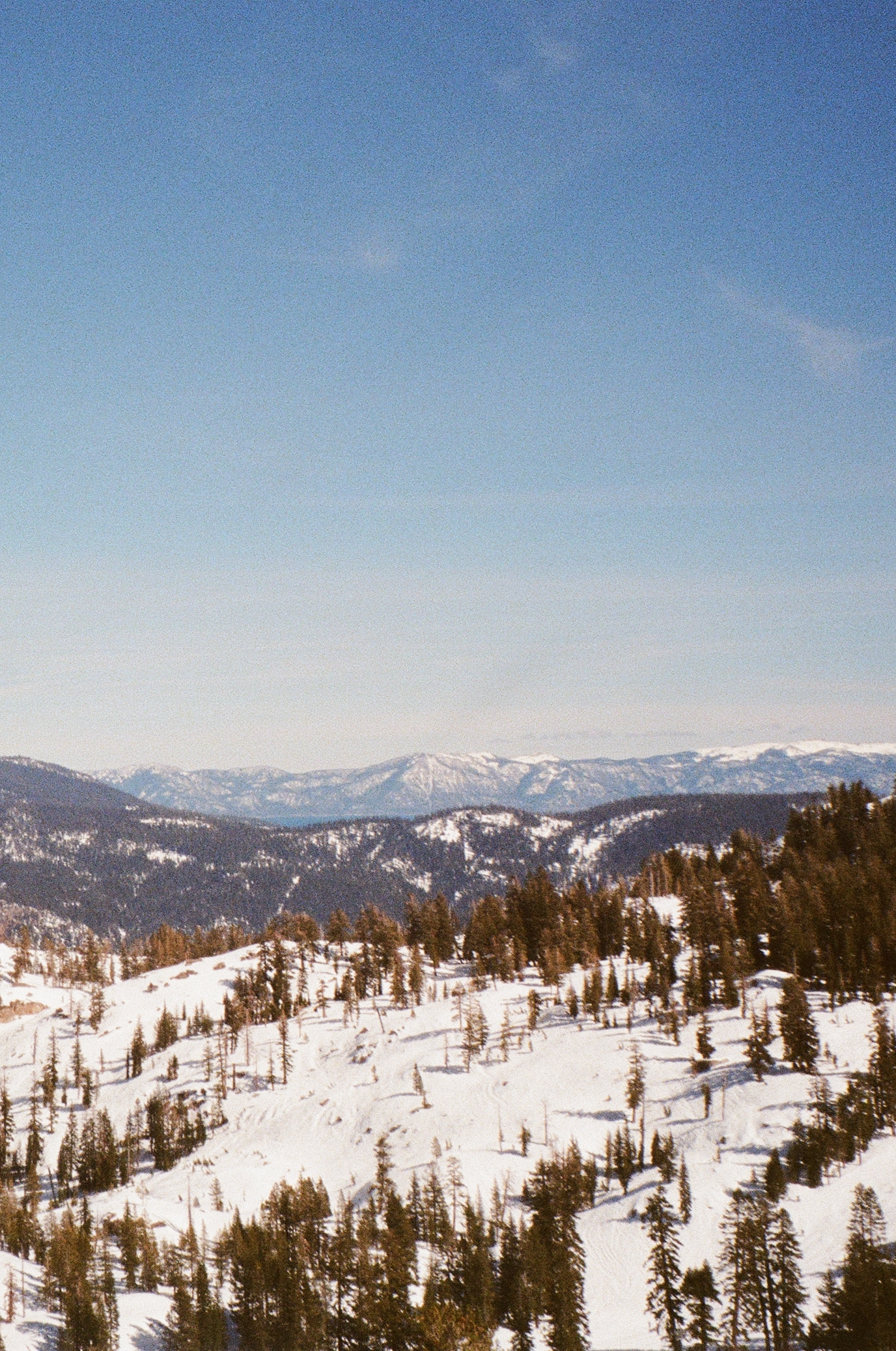
Data: NOAA and NIDIS
Snow
Palisades Ski Area
Tahoe National Forest, CA
Mar 2021

Interaction tips:

  • Mouseover each dot to get details on the corresponding year, temperature, and precipitation.
  • Filter by time period by clicking and dragging the slider below the main chart.
  • Warning: unlike most scatterplots, time is not on the X-axis — that’s the temperature. Instead, each dot is colored according to its decade.

Fun Fact: You may wonder how so many big fires burned in 2021 when it had such a wet summer. In reality, the summer wasn’t wet. The state only averaged 0.99 inches of rain before an “atmospheric river” dumped over 3.5 inches on the state in the last 10 days of October.

Data: Cal Fire Data: NOAA
River
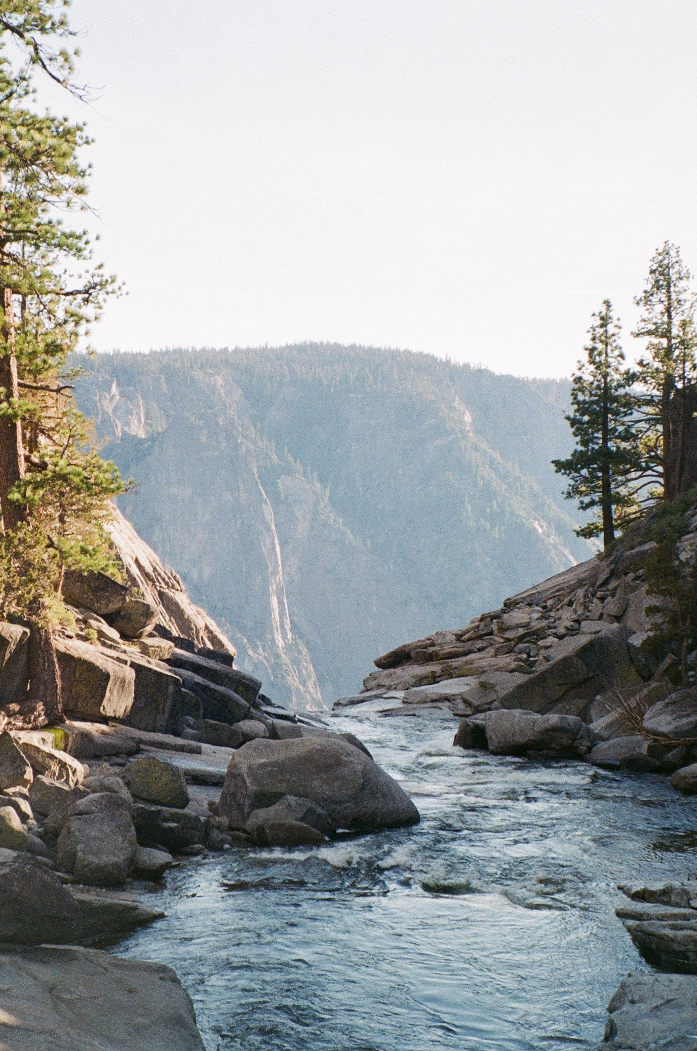
Top of Yosemite Falls
Yosemite National Park, CA
Nov 2021

Interaction tips:

  • Press “Play” in the top left corner or use the slider to see every fire in the last 8 years.
  • Mouseover any fire you’re interested in to get details on the acres burned, the day of fire ignition, and the county.
Data: Cal Fire
Clouds
Lembert Dome, Tuolumne Meadows
Yosemite National Park, CA
Jul 2021

Interaction tips:

  • Mouseover anywhere on the graph you’re interested in to get details on emissions in California.
  • Mouseover the red line to see the start year of the cap-and-trade program.
  • Data: California Air Resources Board
Campanile
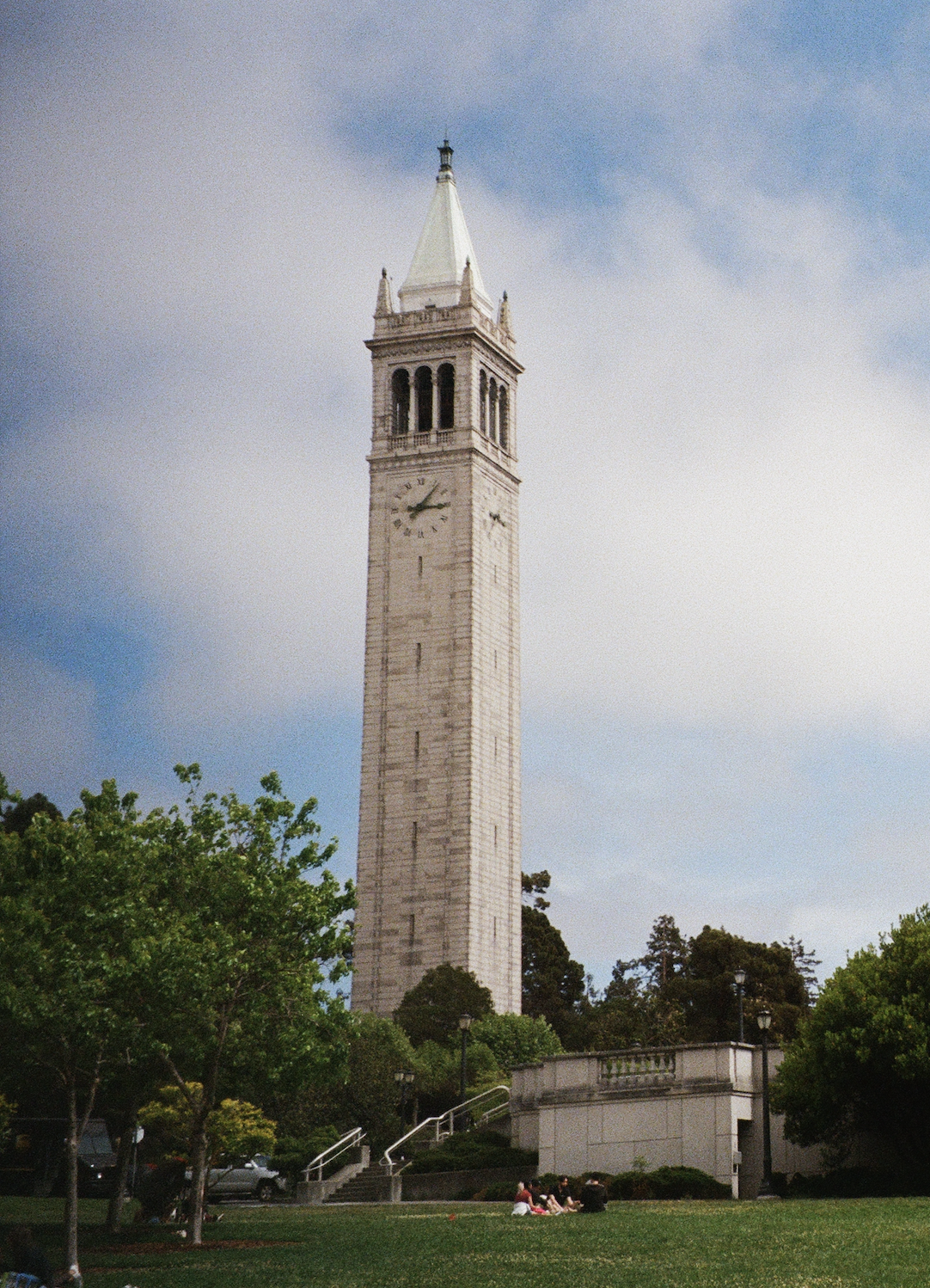
Memorial Glade, UC Berkeley
Berkeley, CA
May 2021
Earth’s climate has been getting warmer — since 1981, Earth’s average temperature has risen an average of 0.32 degrees Fahrenheit per decade, and 2020 was one of the warmest years ever recorded in our planet’s history1. As the temperature of the Earth ticks up, we start to see drastic changes in our natural surroundings: glaciers are melting, oceans are rising, and natural disasters are becoming more common2.
One of the main drivers of climate change is human activity, or more specifically the carbon dioxide (CO2) emissions that come with it. Burning fossil fuels, deforestation, manufacturing and other activities all release high volumes of CO2 into the atmosphere3. Increases in carbon emissions are responsible for two-thirds of the energy imbalance that is causing Earth’s temperature to rise4.
By measuring yearly global CO2 emissions, we can begin to investigate the magnitude of climate change. Below is a graph of the CO2 production from the top 10 emitting countries.
As you can see, worldwide CO2 emissions have increased exponentially since the 1950’s. The US is currently the second highest global CO2 emitter, with a general increase in CO2 emissions since the 1900s.
As students at UC Berkeley, we’re interested in zooming in on our home state California. One way to examine CO2 emissions more closely on a state level is through cap and trade policies. According to the California Air Resources Board (CARB)5, California’s Cap-and-Trade program establishes a declining limit on the state’s greenhouse gas emissions. Starting from 2013, each facility participating in the Cap-and-Trade program receives limited amounts of state-permitted emissions called “allowances” that decrease every year, amounting to a firm cap of total state emissions that declines over time. Facilities that emit more than their allowances are heavily penalized. However, companies can buy more allowances from state auctions to avoid the heavy fines or trade their unused allowances to profit.
From cap and trade data, we are able to analyze CO2 emissions reported for different California counties from 2011-2019.
To truly understand the effects of increased CO2 emissions and global warming, we need to look into how California’s natural weather patterns and resources have changed in recent years. Below is an interactive graph of precipitation over different periods of time.
All those recent dry years have resulted in droughts. In fact, 2011-2015 and 2020-present have been 2 of the most intense droughts in California history6. As of today, December 8, 2021, 80.3% of the state is experiencing D3 “Extreme Drought” with 28.3% of the state in D4 “Exceptional Drought”.
The visualization below presents California’s drought level since 2014 on a yearly county-by-county basis. Look at the counties that have been most affected by drought — the darker ones — in the last 7 years. Are they the counties you expect?
Unfortunately, California isn’t only getting drier. It is also becoming hotter as we move further into the anthropocene. In the summer, California’s fire climate is becoming increasingly fierce. Of the last ten hottest summers since 1895, all ten have occurred since 20007. Those years also account for 15 of California’s 20 largest fires (by total acreage burned) since 19328.
This chart shows exactly that — California’s fire climate from May-October every year since 1895 with encodings of the year, temperature, precipitation, and Top 20 Fires.
As you might expect with this new climate, our state is not only setting records for the number of big fires each year but also redefining what constitutes a big fire. We had never seen a fire burn more than 275,000 acres before 2017. It’s occurred 7 times since then with 2020’s August Complex Fire and 2021’s Dixie Fire burning more than 950,000 acres each8.
Check out how those new larger fires are starting to define California’s fire landscape in the viz below. Cal Fire has data on the date, location, and size of every California fire from 2013-2020.
The best time to reduce greenhouse gas emissions was 100 years ago. The second best time is now. Though we’ve done nothing but increase our production over the past century, California has finally turned the tide. With the adoption of Cap and Trade, the Golden State in 2019 — before the pandemic — generated roughly 50 million fewer tons of CO2 emissions each year than in 2012. There’s hope yet — especially when we’re the lucky ones in position to confront and build the solutions to this climate crisis.
Who we are
We are a group of graduate students at UC Berkeley working towards Masters degrees in Information & Data Science (5th Year MIDS Class of ‘22). When presented with the chance to make a visualization website as part of our W209 Data Visualizations course, we jumped at the opportunity to explore climate change in our home state and to bring these visualizations to life. Thanks for visiting our site, we hope you learned something new!
— Casey McGonigle, Jenna Morabito, Kaavya Shah, Meer Wu, Joyce Li